keita
June 5, 2019, 3:51am
119
Now that I finally read the paper (thanks for the link!)… (drum roll, please)
Highlights from this paper (because we all know most people aren’t going to read the whole thing):
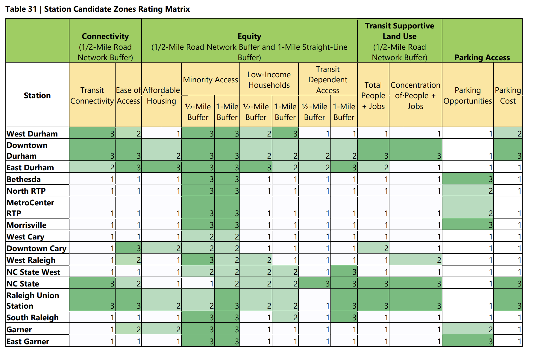
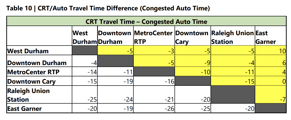
Note for Table 10: more negative = commuter rail gets there even faster than car
on what is(n't) defined by this study:
[S]pecific station locations are not identified and are subject to future studies to determine the actual location of the station platforms. […] In future phases, alternative sites for the stations within the candidate zone (or additional candidate zones) will be identified and evaluated in terms of physical design constraints, access to local land uses, and operational analysis with the other rail services within the corridor.
on what defines Ease of Access:
[Ease of access] measures the number of intersections within a one half-mile of each CRT station candidate zone to identify the pedestrian accessibility of the area surrounding each station. The one half-mile buffer is measured using the street network, not straight-line distance to incorporate natural and built barriers into the analysis.
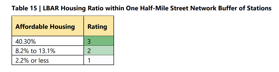
Note for Table 15: LBAR = legally-binding affordability-restricted area. It’s interesting to see the differences between the areas that have each ratings…
Why the study looked at ridership as a ratio:
This measure was chosen to evaluate the relative performance of the scenarios and not produce a specific estimate of daily ridership. The refinement of the ridership estimates will be done in future phases of the study [but we assumed three cars per set in our results].
[…]
The term “vehicle revenue hour of service” [means] the number of commuter rail passenger car (defined as a vehicle) hours of revenue service. This is not the number of train hours as a train is comprised of multiple passenger cars or vehicles.
[…]
[Commuter train services we compared our math against] ranged from a low of 21 for the A-Train in Denton, Texas, to a high of 64 for the MetroRail in Austin, Texas.
6 Likes