Oh by the way, you can see that presentation now!
Click here for the design criteria and overarching ideas.

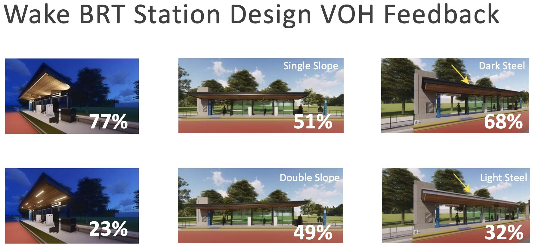
From the survey city planners released last Spring, this is what people say they preferred for station designs:
As for artwork integration, people also showed a preference for pieces that also serve practical purposes (e.g. seats, lighting, signs to help you navigate). That portion of the survey results will also be incorporated into standard ways for how art will become a part of each BRT station.

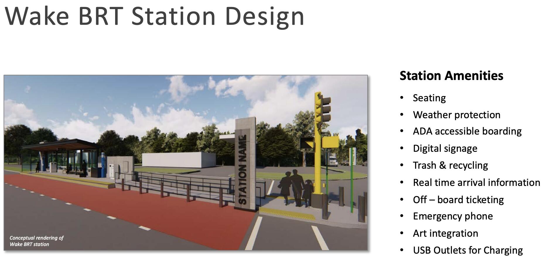
The slide deck included these renders of New Bern line stations. The specific styling of the Go+ logo, the bus livery etc. are NOT YET FINAL.


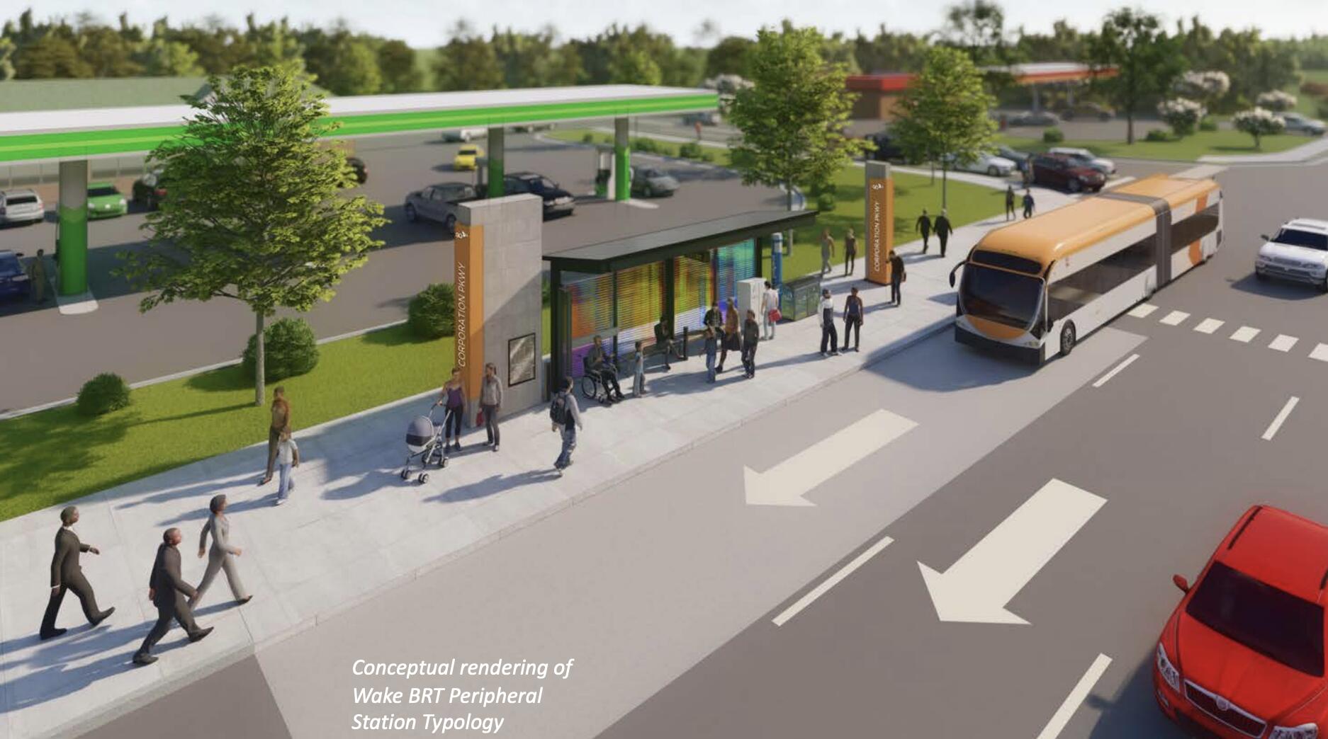
If you thought “the stations could use a bit more color”, remember that this is just the standard layout of BRT stations. Public artwork is also expected to become a part of each station (see that hidden text above for details), which should make stations look more lively.
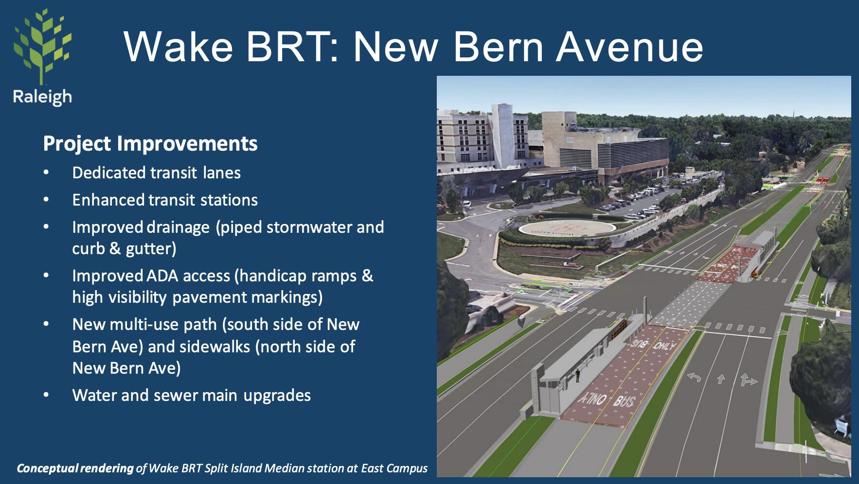
The City Manager’s updates also included a new slide deck that wasn’t there before, with more engineering details as well as a preview of the WakeMed area:

Also, for the New Bern Av. line, station area planning efforts are also looking into how to better redirect and refocus engineering and rezoning efforts to benefit nearby residents, keep housing affordability from going off the rails etc. They mentioned this as their game plan and next steps for the coming months:
