11 Likes
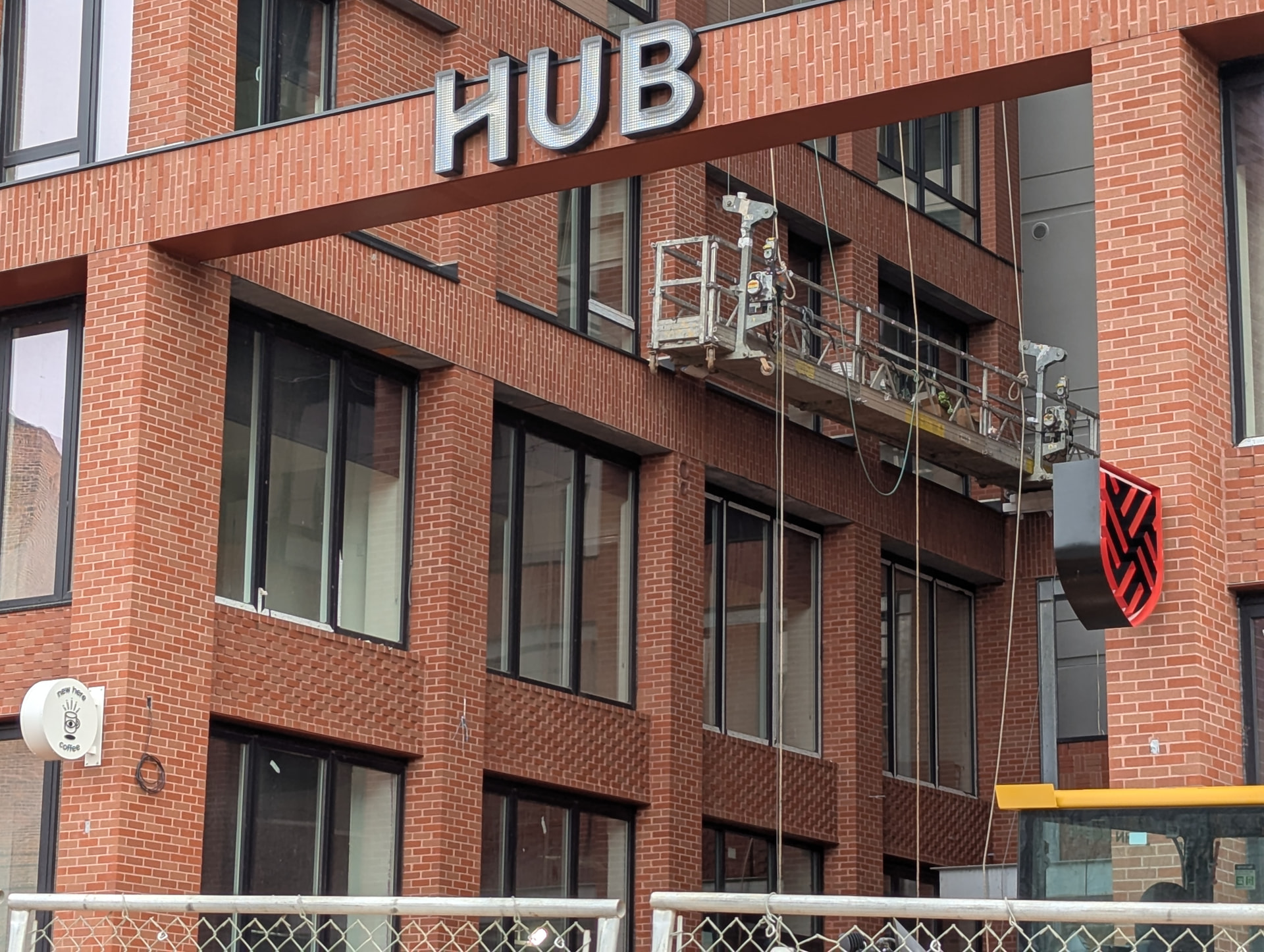
The other logo is the HUB logo.
I cannot imagine what they were thinking with this. It literally has a swastika embedded into the design, and to make sure you don’t miss it it’s also red and shaped like a military shield patch.
4 Likes

8 Likes
can always count on the biscuit to roll his eyes, but it is so incredibly easy to design a logo that does not embed a swastika, rotated 45 degrees, on a red, black and white color scheme. just do literally anything else.
8 Likes
What a weird take in here. It’s clearly not a swastika. Also I didn’t know red, white, and black were off limits since ww2 ended.
2 Likes
Just to be clear I am not accusing them of doing this intentionally or being Nazis or anything like that. It seems to me like this might be a very unfortunate unforeseen logo treatment.
The logo using white as the whitespace color as shown on the website is just fine, would not have batted an eye. But seriously, go take a look at the black-and-red treatment in the physical sign, and the construction they used to produce the shape raised against the background… it really changes the picture.
<Edit: I drew an outline around it but that kind of felt like crossing a line tbh, I’ve taken that down quickly>
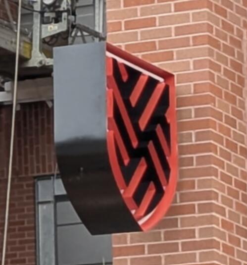
I wasn’t trying to exaggerate, there’s a literal swastika embedded into the physical shape of the line work as seen from the rear side (which reverses the actual logo, where the shape is still technically present but less recognizable as the orientation is reversed).
The combined effect of using black as the “whitespace” color (making the emphasis inverted), using red as the second color… anyway, I’m very confident some of the college kids will inform them of the resemblance.
4 Likes
This shield appears to be inverted, and results in the gaps being in the same orientation as the Nazi swastika. If they flip it around, it shouldn’t be as obvious to those who are looking for that symbolism.
Edit: I just realized that the other side would appear as the typical shield, so flipping it would still have the same issue. They would need a new sign to maintain the same shield orientation on each side.
1 Like
That’s exactly what tipped it over from unremarkable (there’s plenty of logos that vaguely resemble the symbol, make a remark to your partner and move on) to truly (and honestly, hilariously) unfortunate for me – this perfect storm of reasonable choices (red for NCSU, embossed to make the backlighting work on the colored lines, mounted horizontally because they want it visible on Hillborough) that landed them with a sign which… I will be surprised if it survives one semester before being replaced (or at least painted).
1 Like

@grant has a point though. Also being student housing/near a college campus, you have people who think there are Nazis under every rock.
2 Likes
Idk… it LOOKS nefarious in our current state of affairs. Like literally design any other logo, WTF are they doing??? lmao
2 Likes
wow, kind of crazy how different the digital version is from the 3D one.
Even the difference in line-weight between the “prongs” and the in-between space makes you read the digital version completely differently… In the 3D version they’re almost equal in width. I also think inverting the embossed areas would’ve really helped.
The unfortunate thing is I think they were too lazy to design anything themselves at all. A reverse image search brings up several social posts for a company that is “Thailand based, Dutch family owned.” I think they just picked an off the shelf sign. I don’t know if that makes it better or worse.

Scroll down for their other Hub locations.
All have shield/badge logos with different infill patterns for each.
Just an unfortunate design choice for the Raleigh location.
That’s good, I stand corrected!
My G, nobody is “offended” by this logo design, we’re just flabbergasted by how egregiously close it is to appearing to have a Swastika in it lmao. Just an insane design choice, especially in this day and age where Nazism seems to be, unfortunately, making a comeback.
13 Likes
I did not mean to trigger anyone, whoops. I’m not that old, but old enough to recall a time when finding an accidental offensive symbol in a company’s logo was just a thing you had a chuckle over, maybe put bets on when they’d realize, and move along.
Nobody here is angry (over the sign at least) and no one accused the owners of anything… besides making an innocent but amusing oversight.
Maybe my original wording was too ambiguous, so just to be clear.
3 Likes
swastika is common in thailand, but the hub owners probably just didn’t notice. also i didn’t notice either until i read this whole back and forth, to me it looked like a shield
4 Likes