If you’ve ever been unfortunate enough to a convention in Orlando, you can’t avoid going on their open bridge with hypothetically jumpable railings to get between buildings (bottom of the image), and it works fine except for the sweat.
Trust me, car exhaust is preferable to stale convention air after a couple days.
Rounded looks awful, like it was designed by AI or an overzealous design student. When you’re using a design language that is that foreign to its context, there should be a reason or a concept driving it. If this was a video game company’s headquarters, sure, but it seems totally without purpose here.
Edgy makes the most sense at first glance and I bet they’ll pick this one because it’s safest – it feels like a continuation of the existing convention center’s design language, but it’s still elegant, even if a bit generic.
Curvy is my personal favorite. It’s a really interesting resolution of the massing – I like the frame at the southeast that looks like it creates a balcony/overlook; I like how the massing steps down just to the left to create some variation (whereas in “edgy” they continue the fin screening up to make it appear like a double-height volume) and I like that it actually feels edgier than the “edgy” scheme. It has enough similarities to the existing convention center to make it work, but it still has its own character.
I’d propose to relocate the Shimmer Wall (if it is possible) to the parking deck so it will be more visible once the new CC is built. It would create a “back wall” to the new Red Hat and make it visible since there won’t be a building right in front of it.
At a BNL concert years ago they made a comment about “Kevin Hearn and the Shimmer Walls” after one of their improv riffs they do so well. I think about it every time I drive by.
As much as losing its prominence is gonna suck, relocating the shimmer wall doesn’t make sense to me. Tom Sayre designed it for that building in that location… it shields all the mechanical equipment while allowing adequate ventilation. If it moves (which seems impractical in the first place), what goes there in its place? An entire facade of louvers?
This is an opportunity to create new art for Raleigh, not chip away at an existing building’s integrated design imo.
If not, I’m sure his response would be “Why yes, I’d love it if you hired and paid me to create a whole new art-facade for the parking deck behind Red Hat Amphitheater 2!” and probably not “Sure, move my existing art at your expense. I don’t need any further income!”
Also worth noting that Tom Sayre’s firm Clearscapes was also architect of the convention center. The impact to his architecture is as much an issue here as his art.
Edit: and moving it would be a pretty big undertaking with structural and architectural implications since they’d need to design a new facade to replace it and hire an architect to design the support system for its new location… his firm would stand to gain monetarily either way.
Per RalGov’s Instagram, the Raleigh Convention Center expansion will permanently close South Street (Dawson to McDowell) on April 14, to start prepping for the new amphitheater…
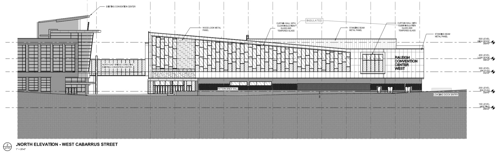
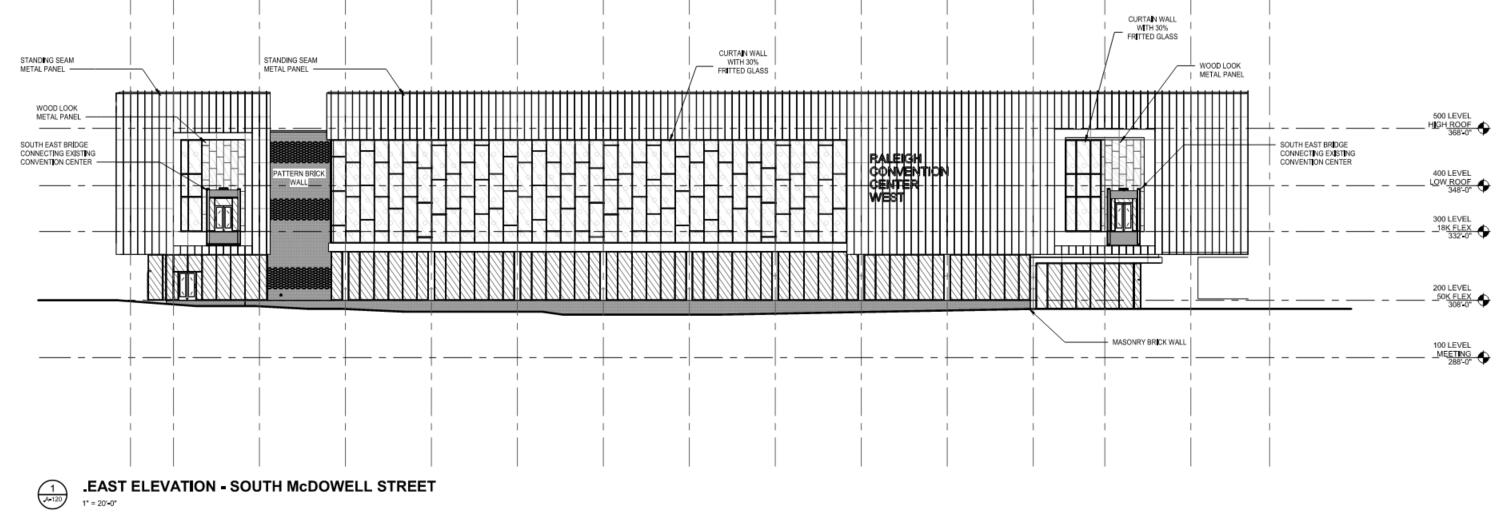
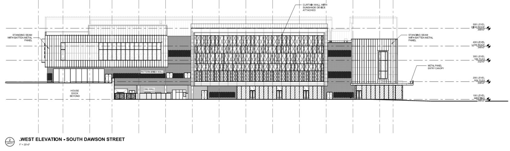
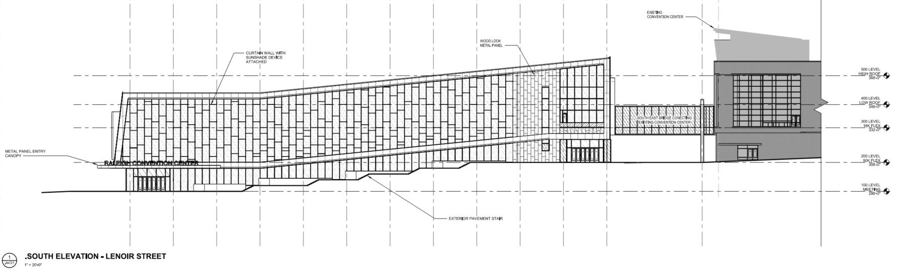
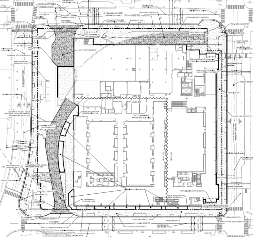
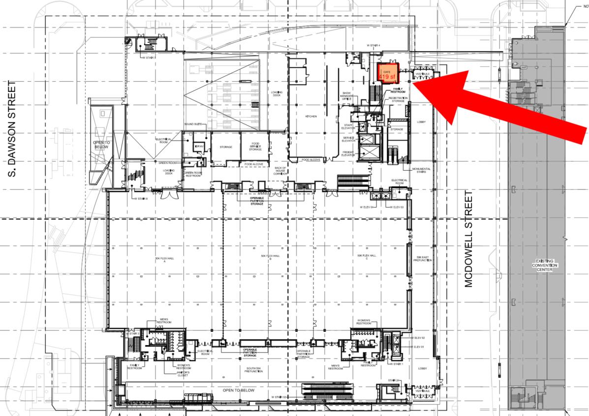
ASR-0071-2025 uploaded. Looks nice. Zero retail or other uses; probably shouldn’t have expected any, but seems like a massive missed opportunity and definitely a deviation from the schematic planning
So it’s smaller than initially planned? The hell is the point then??? I could forgive that if, like you said, they took the opportunity to activate the street a little bit with a gift shop and cafe ATA LEAST. Whatever. Why do I still keep my hopes up for transformative projects in this city lmao
Interesting that they went to the trouble to present those 3 alternatives earlier and to my eye this isn’t any of them. Without the benefit of the full rendering I like this better than all 3
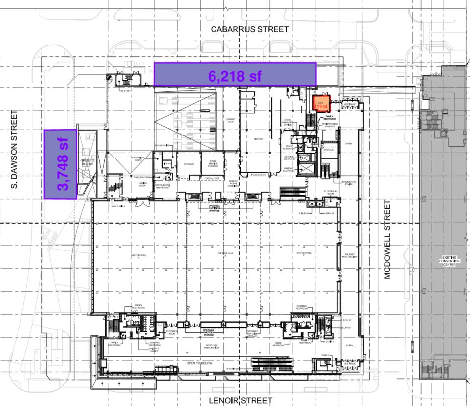
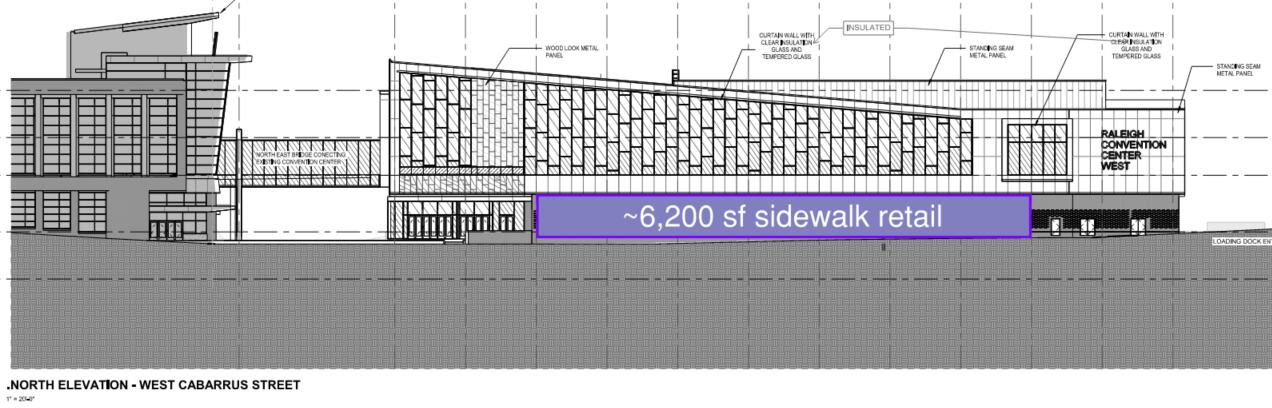
Just an idea… somewhat easily ~13,500 sf added sidewalk-facing retail.. Cover the open air underground loading dock along Cabarrus and hide the electrical yard on Dawson.