That’s a good question. That doesn’t line up to everything we’ve been hearing about for the project.
1 Like
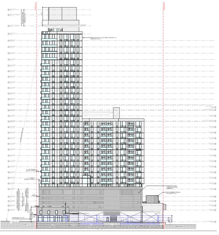
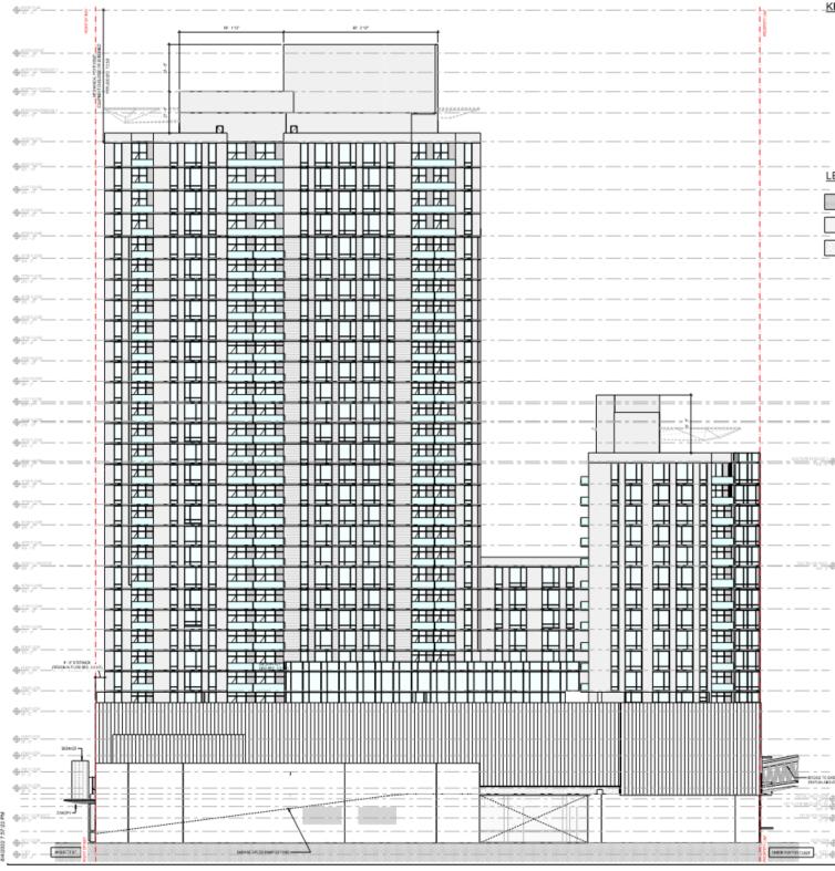
Seems right, 4 levels of parking deck + 27 floors of North residential (27 + 4 = 31), and then 12 floors of south “Residential” which is hotel, which we already know is not being built on top of parking deck.
1 Like
It also sounds like it is 4 levels of parking above the transit facility, so that would be 27 + 5 = 32.
1 Like
And, why is it in the Fuguay-Varina district?
2 Likes
Fuquay must be annexing the RUSBUS block.
5 Likes
Yeah, that was strange to me too.
1 Like
The other thing that I don’t understand is why the new ASR? The project was previously approved under ASR-0072-2021. The new one has the building two stories taller and it says residential for the second tower instead of hotel. Would those changes required a new ASR?
2 Likes
Yes, it does require a new ASR. Once you start changing the massing of the building, colors, schemes, or patterns then it has to go in for a new approval.
6 Likes
Thanks. I assume The Creamery got away with it because they made their revisions prior to final ASR approval.
2 Likes
24 Likes
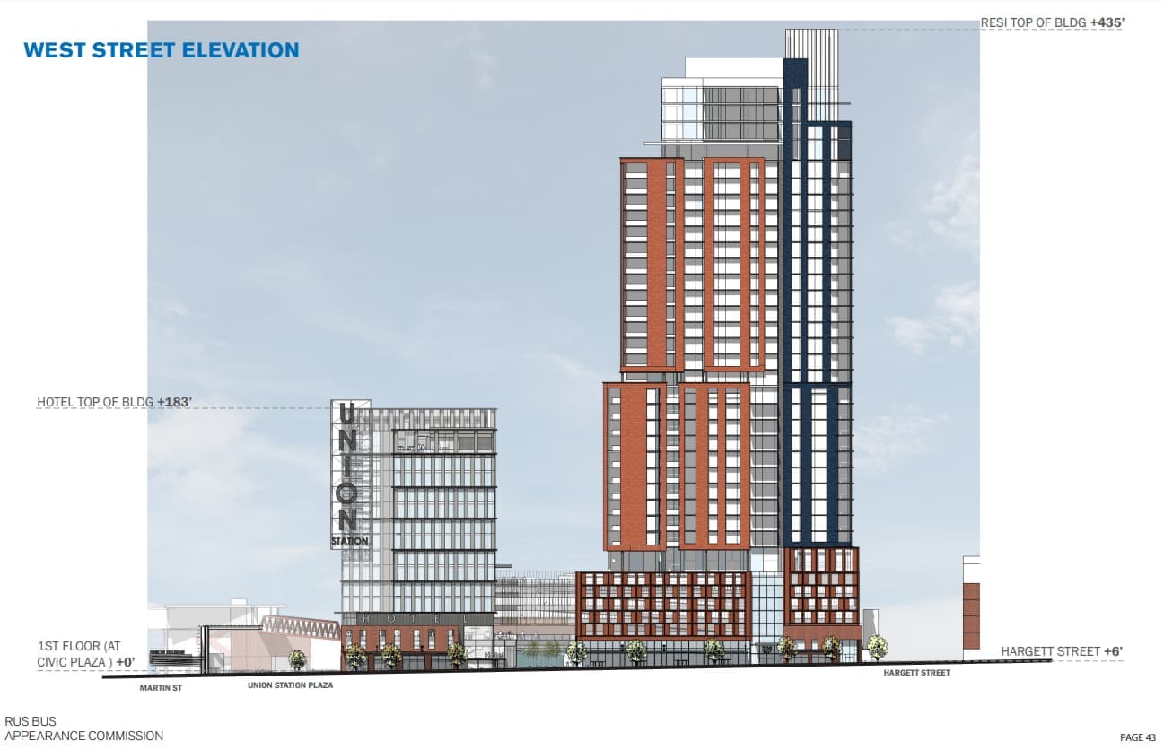
That’s a little disappointing; I think there’s a lot of appeal for a hotel on top of a transportation hub. That said, if you’re going to swap it with anything, more housing is the way to go.
12 Likes
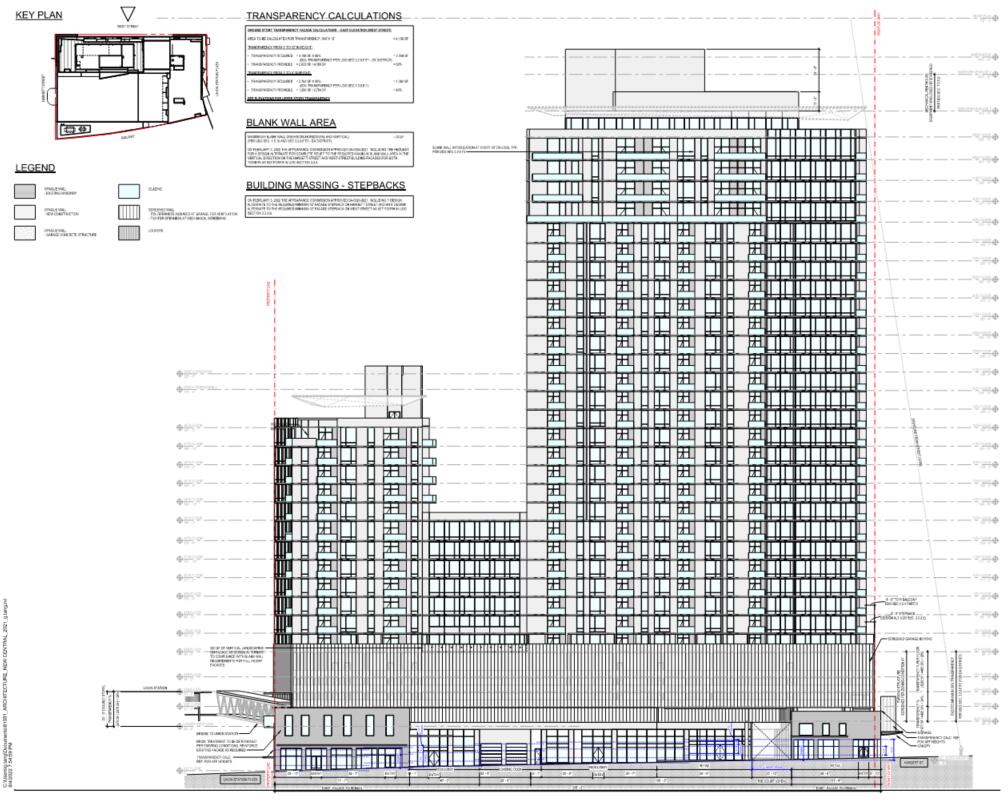
Appears that they also removed the cool, multi story atrium?
Very sad, but very Raleigh! 
2 Likes
I wonder if the City or State, depending who officially received the grant, has some leverage here with the developer?
I wonder who made this call to switch from Hotel to residential, not saying it’s a huge deal, but if the city wanted a developer who would construct a hotel to accommodate the train and bus station, then they change plans. Wouldn’t that breach some level of the contract if so?
1 Like
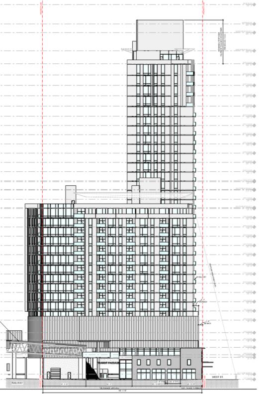
Looks like a beehive. 

1 Like
That was gone even in the previous set.
Maybe I’m missing something but overall just looks kinda bland now. I really liked the 3rd or 4th floor rooftop spaces at the south end of the building they used to show.
5 Likes
There’s the value engineering we knew was coming. The atrium is a loss for a transit hub - the main entrance to a city should feel grand and welcoming.
That said, I’m not judging most of the aesthetics off of a drawing like this until I can see all the materials, etc. Everything looks flat and bland in black-and-white with no depth.
11 Likes
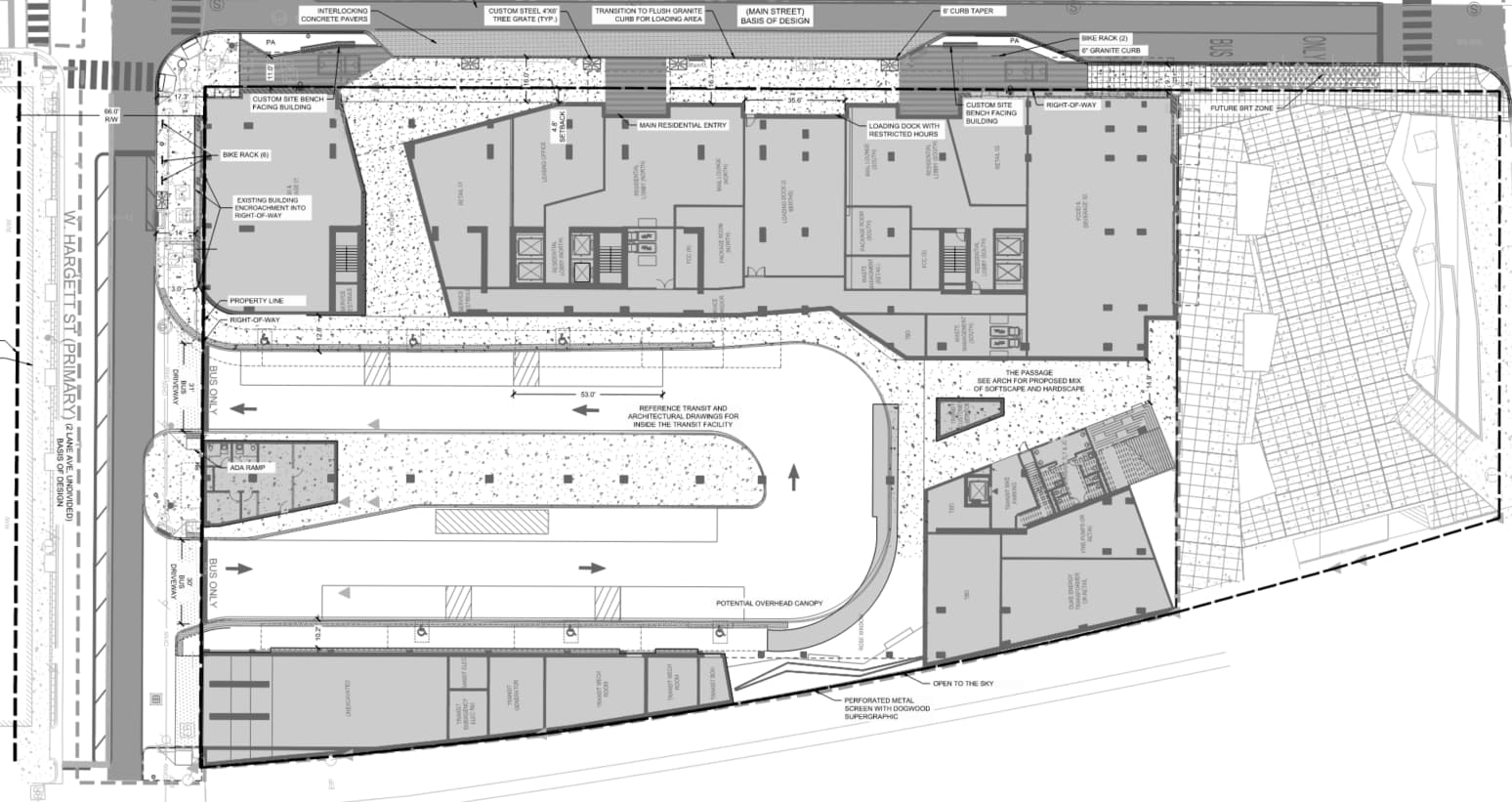
Comparing this new site use plan to this earlier sheet drawing, it looks like the cool atrium is gone -but we still have streetside access to the bus station plus ground-level retail units. So at least we’re not compromising on the basics?
Like @oakcityyimby said, let’s wait until we see more details before complaining.
GoTriangle is the recipient of the BUILD grant. It’s hard to say, though, since their Board of Trustees have been on summer break since the last ASR. Their next board meeting is on the 24th, so maybe we’ll see more details then?
3 Likes
damn, my first reaction was that I like that they simplified the tower. The massing has always bothered me; the step-backs and material transitions looked arbitrary and awkward.
Then I looked closer and saw that this appears to be a much worse design from the perspective of a pedestrian. I appreciated that they were breaking up the block with several distinctly articulated ground-level conditions. That’s gone; now it looks like one continuous base along the entire block. It’s basically gone from two buildings connected to each other to one massive one. The parking deck is much more visible and is given a much more obvious treatment. Still looks like a nice building, and hopefully there’s offsets between the towers and the base to give the different elements some depth, but still… huge bummer at first glance.

4 Likes
The more I look at this the more pissed off I get. Why would the city even allow a switch-up this drastic?
5 Likes
Same. This looks like a completely different project: essentially 2 bland boxes on top of a bigger bland box. Why is this being modified so heavily this late in the game?
13 Likes