Nice job. I especially like the rustic fireplace juxtaposed against the shaker built-ins and the timber shelves. That said, that small window on the facade looks teeny tiny without its shutters. I’d put some operable ones on it to balance that elevation a bit better. Overall, it looks great.
Where’s the solar powered rain-water collection system? The gold-LEED bike share facility? The community garden area? gosh! 
I recently noticed that a “pending sale” sign has popped up in the yard at 10 Seawell Ave. This could be a sign of progress for Five Horizon’s 801 New Bern Condos project
Thayer Homes released an early rendering of what their townhomes on Tipton and Cumberland will look like.
These seem to lean towards the modern side of design.
2 Likes
Those look awful. 
1 Like
“modern”? Is that the new slang for ugly? I guess they aren’t really that baaad, but they sure aren’t good either. It looks like something I use to build with my blocks . . . before Godzilla or some other suitable monster of the day rained chaos and destruction!!
1 Like
You guys realize style is subjective, right? Obviously some people like them, but might not like a building you think is pretty nice.
4 Likes
Yeah, plant some larger trees in front of the grey sections. It will soften the starkness and heaviness of those vertical expanses. that said, I do like the white sections.
1 Like
WIndows are way too small for me. Otherwise reminds me of something I’ve seen in Charlotte. They’ve Got A Lot!™️
1 Like
Haven’t you noticed that 90 percent of any renderings, etc. posted here are ugly, too short, not dense enough, too tan, etc. etc. etc.?
4 Likes
Too square, too much glass, not enough glass, not the Taj Mahal… 
4 Likes
The small windows, and that whole grey section, looks like it could be a jail.
1 Like
Affordable housing…
3 Likes
No clear outdoor space from this angle. No garages. Front doors opening to another. Honestly there is nothing wrong with good modern design, but this appears to be little more then a slightly dressed up rectangle. Its certainly not the worse thing I’ve seen, and the materials, particularly in the grey area could make a difference. Taste is subjective, and no doubt they will sell, but my two cents: blaaa.
Is that siding on the left side? I don’t have a problem with the design. Variety is good. But this could look awful with cheap materials.
1 Like
Imagine in 15 years.
Imagine if it’s vinyl siding.
1 Like
Looking at the actual plans submitted to the city might produce better assumptions.
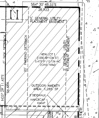
There are two total outdoor spaces per unit. The rooftop terrace and a shared outdoor amenity area totaling 1,285 SF. I’m sure will become a dog park style space.
 ![image|690x285]
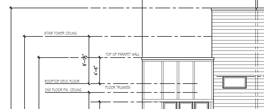
Below you can see the anticipation of the deck from the plans.
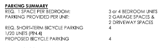
Also there will be a garage for each unit with space for 2 cars inside and 2 cars outside in the driveway.
From the plans:
In my opinion there is not much difference between these and the 10 on South Person.
These have no outdoor space…
2 Likes
Thanks @Drew! That does help. A rooftop will be nice, and sure a lot better than nothing. The materials there on Person St look pretty good, but I just can’t imagine having no outdoor space.
They look cheap to me. Also, its hard for my non-architect, therefore less than human opinion to express this, but they look more ‘contemporary’ to me whereas the 10 on Person are modernist fused with contemporary. I know I am misusing the term contemporary (it has a ton of latitude though right?) but to me that more or less means a dumbed down version of some other truer aesthetic. So as a dumbed down, half-a$$ modernist attempt, I give it a contemporary label. The 10 are much better materials and closer to a good modernist cut, though a tad conservative, so its ‘fused’. Whatever. Attempting to make objective things that fuse and transition is somewhat futile.
4 Likes