Retail/office proposal in South Park. Merge Capital
1 Like
I came across this in the twittersphere today and it was news to me! I think we will see more of this type of development on the boarders of downtown.
11 Likes
A group of neighbors to this project have already reached out to the developer to ask that they change the name to something more inclusive instead of taking the name of the whole neighborhood. Merge Capital replied that they have hired a PR firm to come up with other name options. Otherwise, the neighborhood is very excited to have retail and job prospects within walking distance.
13 Likes
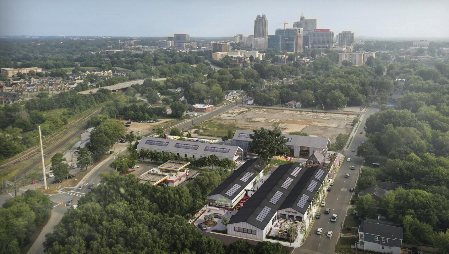
Excited to see the recent and future investments being made in South Park / southeast DTR:
- Bike lanes added to Person and Blount streets (and the eventual conversion of both streets from 1-way to 2-way)
- This one (Merge Capital’s mixed-use plan)
- Stanley-Martin Townhomes planned for the block directly to the north of this one
- John Chavis Memorial park currently undergoing major renovations
- BRT phase 2 planned to come down Wilmington
- (did I miss any?)
It feels like development has been slowest on this quadrant of downtown in this development cycle, but there seems to be some real interest just in the past year. I’m actually really surprised it’s taken so long, since it’s so convenient to 40 via Blount/Hammond and Hammond continues into Garner which has been growing. I wouldn’t be surprised if over the next 10 years or so we see the beginnings of a dense corridor a la Glenwood South form between, let’s say, Moore Square and Hoke street.
8 Likes
You can add to the list the Goodnight project with future brewery bhavana tap room, slingshot coffee and artists spaces at Hoke St and the ripe-for-development Cargill site
1 Like
All of those things are already there (‘cept it’s a Bhavana production facility and not the tap room yet.) My understanding is the Goodnight rezoning, for the time being, is just a paper move. The rezoning allows one of the lots to be counted as parking which will meet the requirements for the tap room. I‘m not sure how guest ready the brewery is currently.
3 Likes
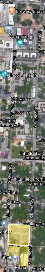
Has anyone heard anything new on the Carolina Coach development in South Park (between Blount, Person, Bragg, and Branch)? It seems as if the re-zoning request has been stagnant since May 2019.
4 Likes
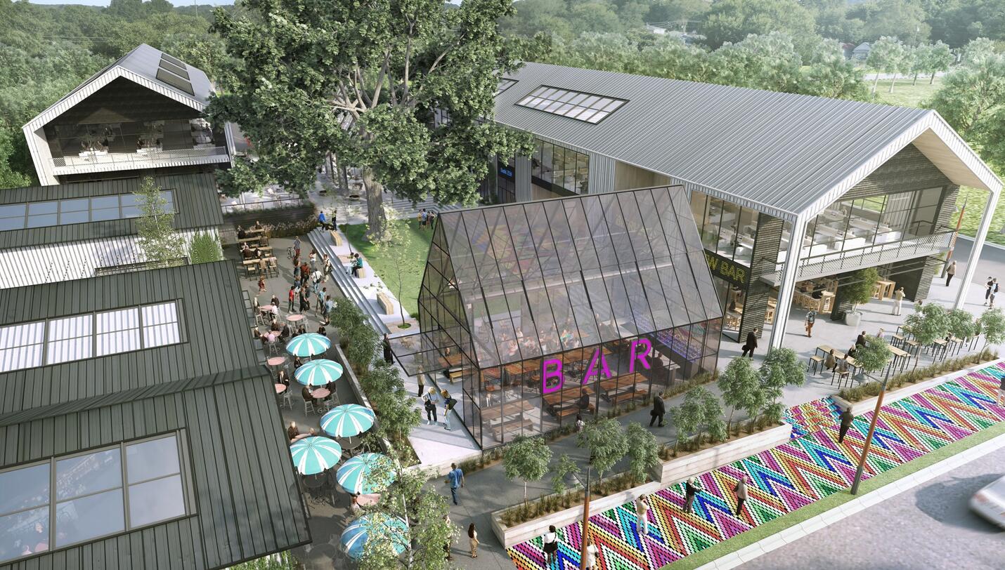
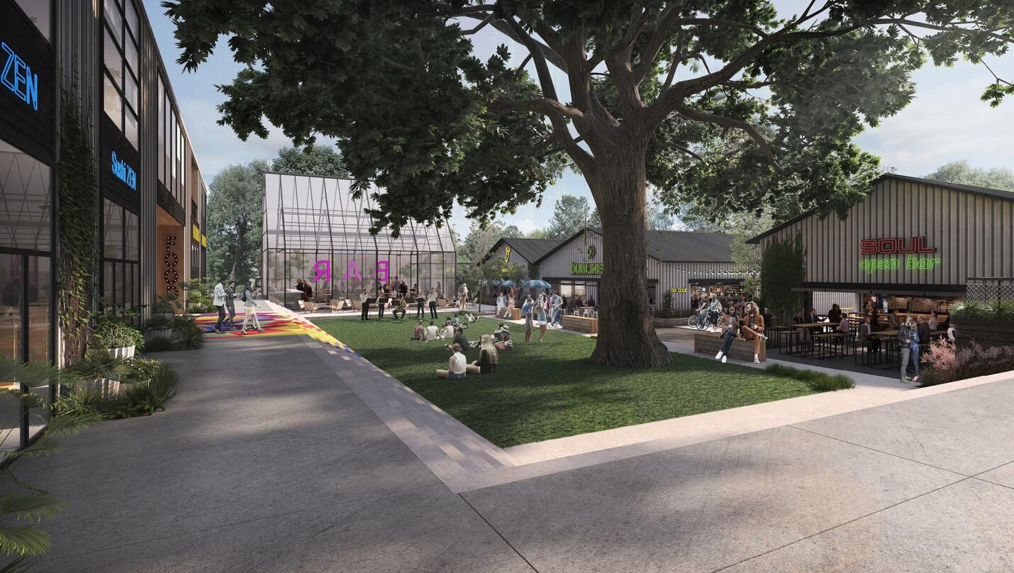
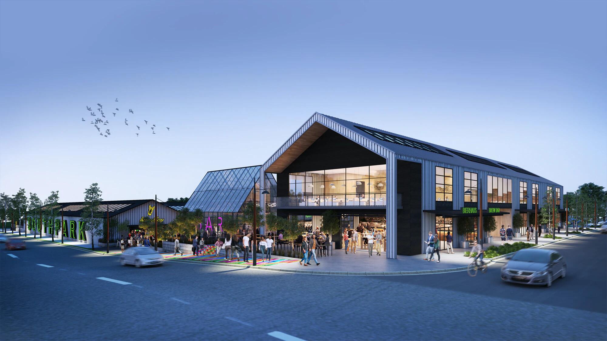
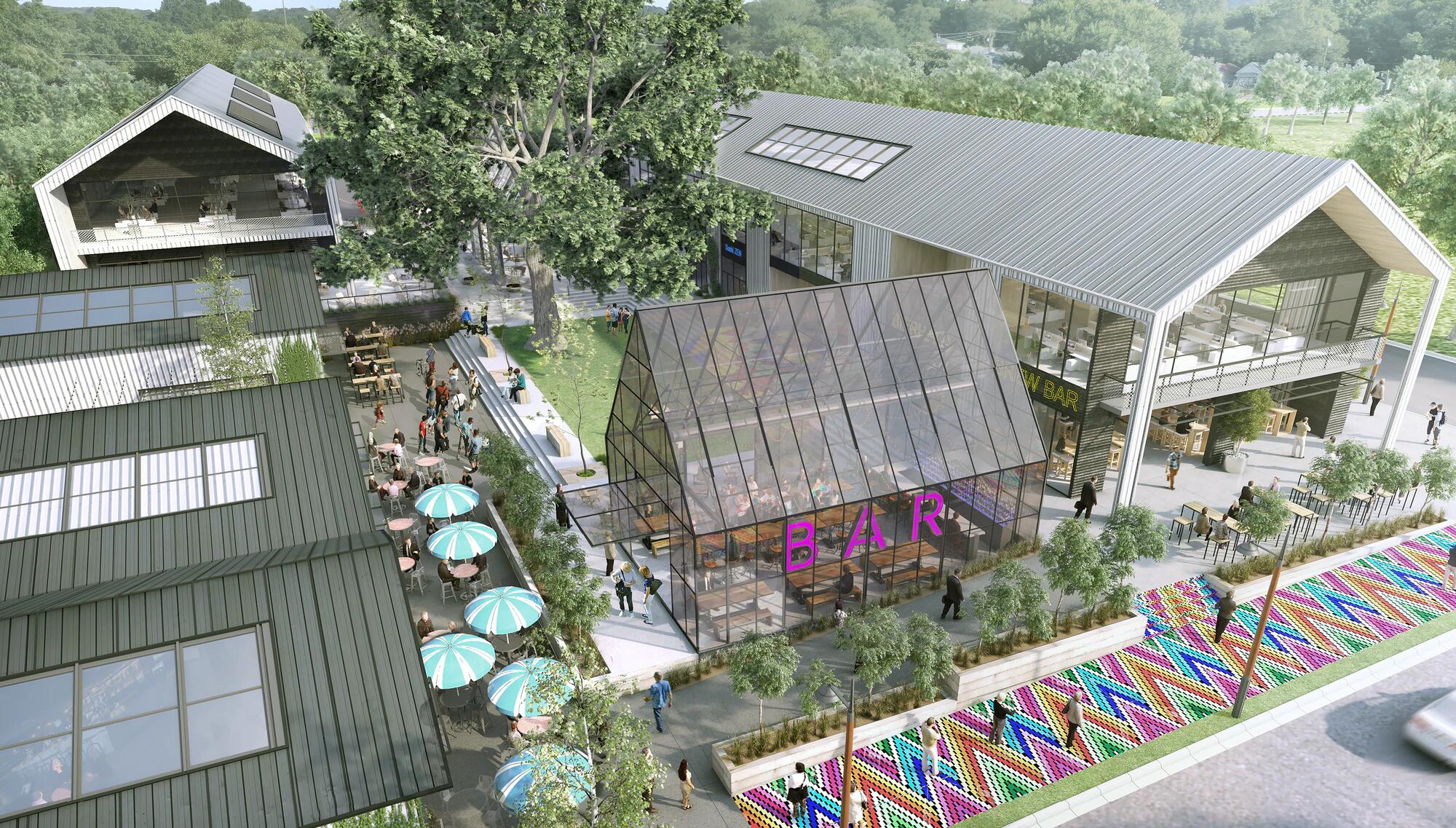
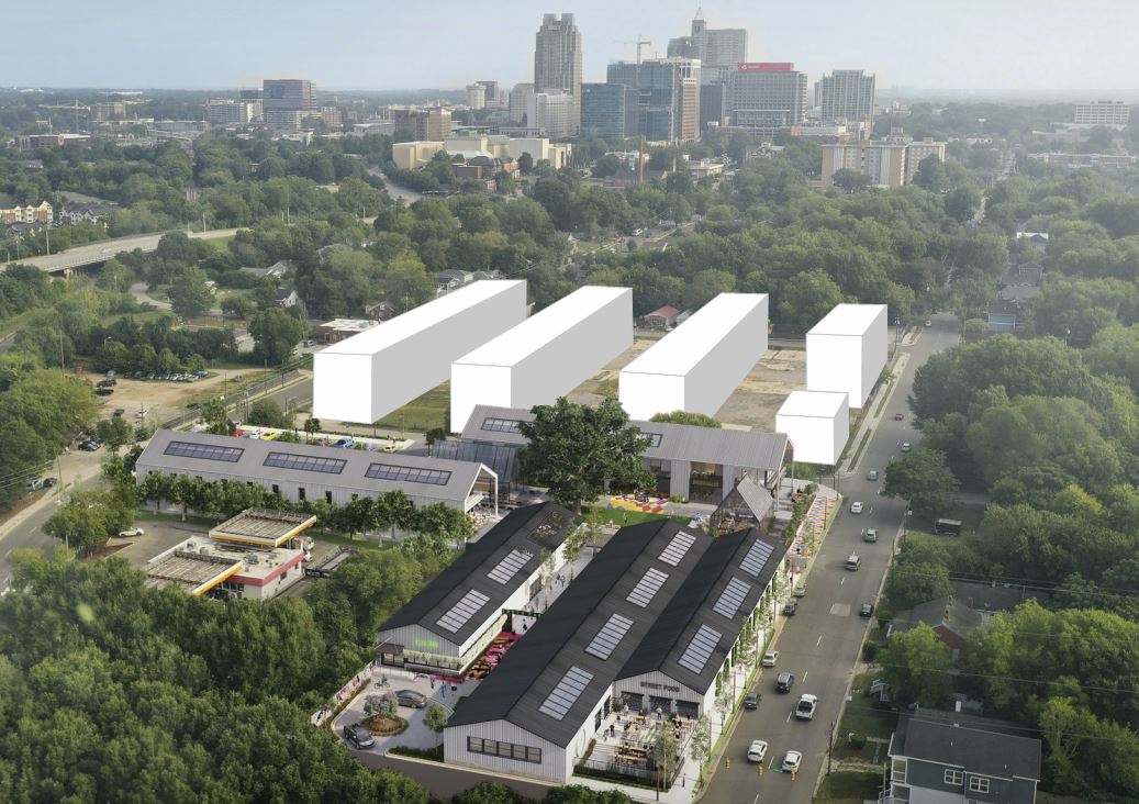
Site Plan on the City’s website:
Two 2-story ‘shopping center’ buildings. Looks like its the phase 2 (north side along Branch St next to the other warehouse renovations & additions)
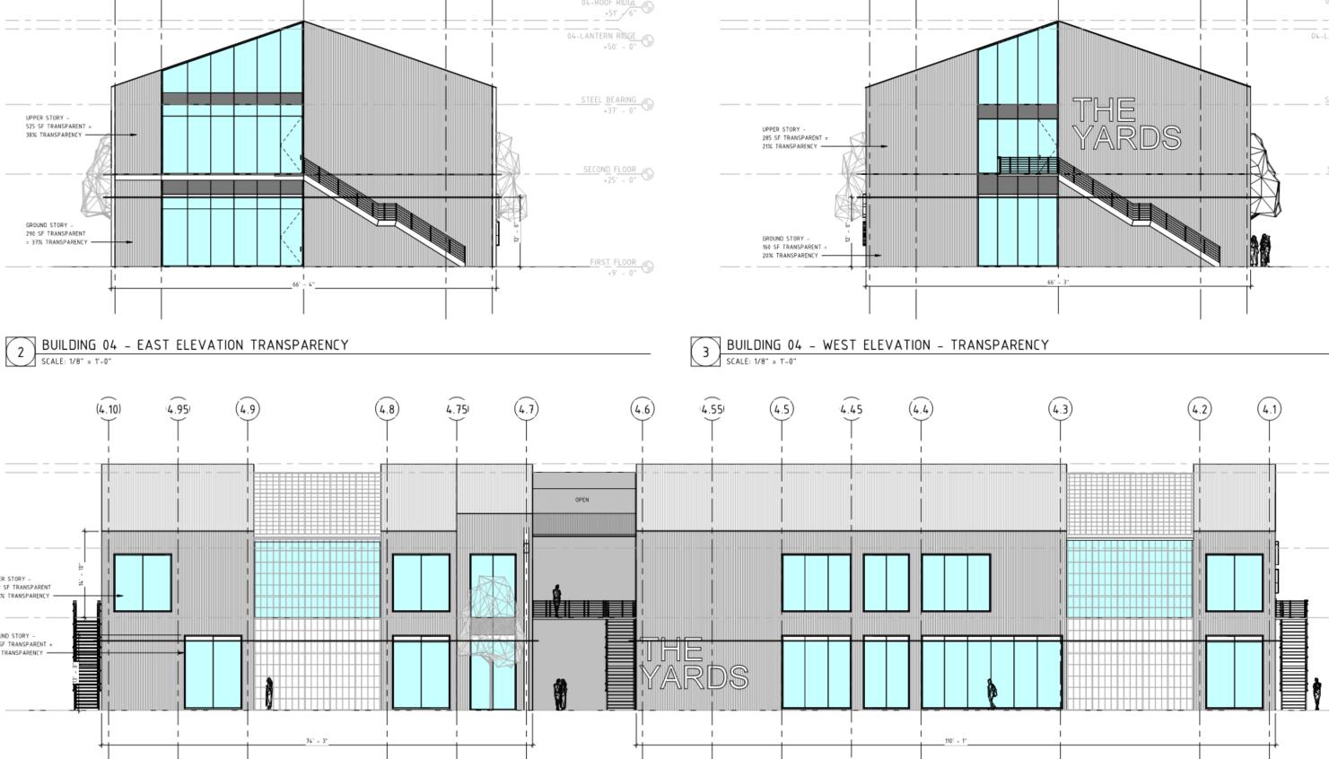
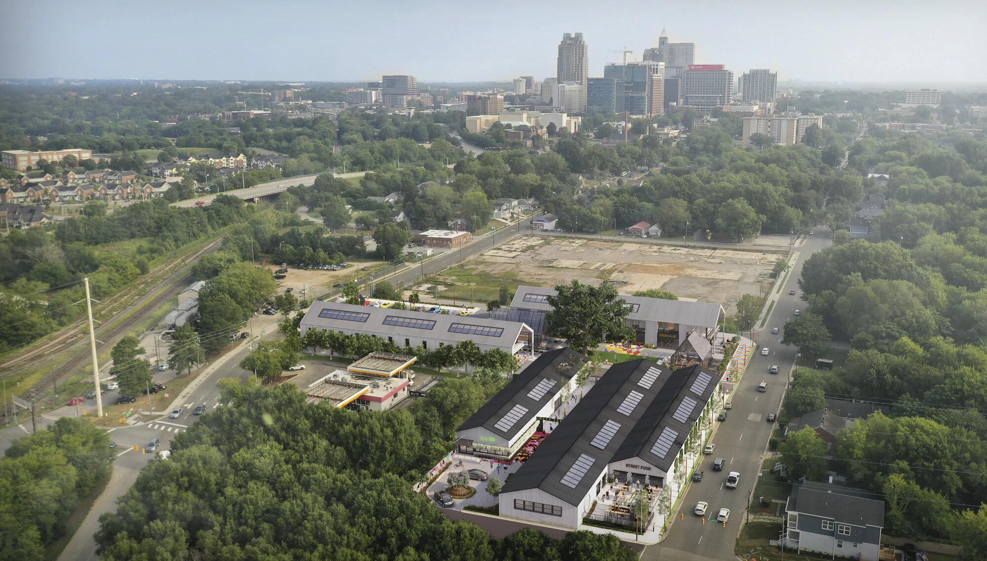
image source: Merge Capital
24 Likes
This is a very exciting project. A potential “district maker”
8 Likes
Man, this is probably the project I’m most excited about in Raleigh, but I’m super disappointed with the direction of those elevations. I want to see the same level of design rigor from the concept renderings translated into the actual design, and it doesn’t look like that’s happening. Looks like they also switched design teams, because the design in the renderings was definitely produced by a higher caliber firm than Maurer. This is just a site plan review though so hopefully they can bring it a little closer to this standard.
7 Likes
I’m coming from a residential perspective so caveat be known, but that design looks very minimalist and basic to me. It doesn’t see like it would require an elite firm to reproduce that look, especially with a new build. I may be over simplifying it, but there are no complicated roof structures or details to work out it seems. 🤷
2 Likes
I’m not really talking about the complexity of detailing or construction; it’s the quality of the design work itself, the little moves that make a design really sing. (On that subject, I actually just worked on a library in Delaware that has the same move of turning the metal roof to become vertical cladding, and getting that transition to appear seamless while detailing an integral gutter was a pain in the ass. The devil’s in the details, as you know, and getting projects to look clean and simple takes much more skill and is seldom the easy way out).
3 Likes
The design in the renderings is really well-done though, and I don’t think Maurer’s usual work is on that level. Small example – look at this elevation. Maurer’s looks like a typical warehouse building with a storefront opening cut into it. Nothing that would warrant a second look if I were passing by. The concept design on the other hand extended the roof forward to shade the entry and a balcony, which would help activate this street corner.
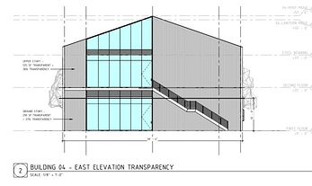
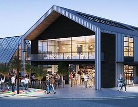
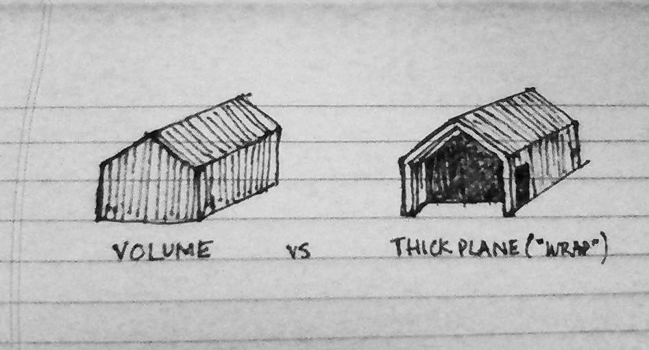
Getting into nerdy architect things that no one else cares about here, but at a conceptual level it also allowed them to express the thickness of the roof and use a secondary infill material, which creates the effect of a thick metal plane wrapping over the buildings on three sides (N, S, roof), as opposed to a uniform metal volume. One’s a boring and typical warehouse; the other’s nothing groundbreaking but is a little more intentional and interesting. It would’ve been a nice contemporary, complimentary language to the existing warehouse buildings that they’re renovating next door.
8 Likes
Don’t underestimate this crowd’s enjoyment of nerdy architect things @elevatoroperator !! You are so right that its most often those little details that take something from utilitarian to inviting.
5 Likes
Agreed on the analysis, however these might just be simplified elevations for the transparency calcs. Detail within solid / opaque materials might not be shown here? It does look like there is some sort of balcony since there are stairs and a door on the 2nd floor.
Now if we dream even a bit bigger and put the MLB stadium down there, that would become a very cool little area.
6 Likes
You are right, please email your findings to Merge Capital 
1 Like
Right in that field behind it. (Probably too small but still)
Judging from Maurer’s past works that I could find, I don’t really have my hopes up, either ![]()
From their website/portfolio, it’s pretty clear that their commercial design skills are kind of bland -and they don’t really think in 3-D as much. Sure, their designers seem to enjoy using different textured materials to spice up appearances, but that’s like adding salt and pepper to a cup of instant ramen; their works have literally no depth.
For example:
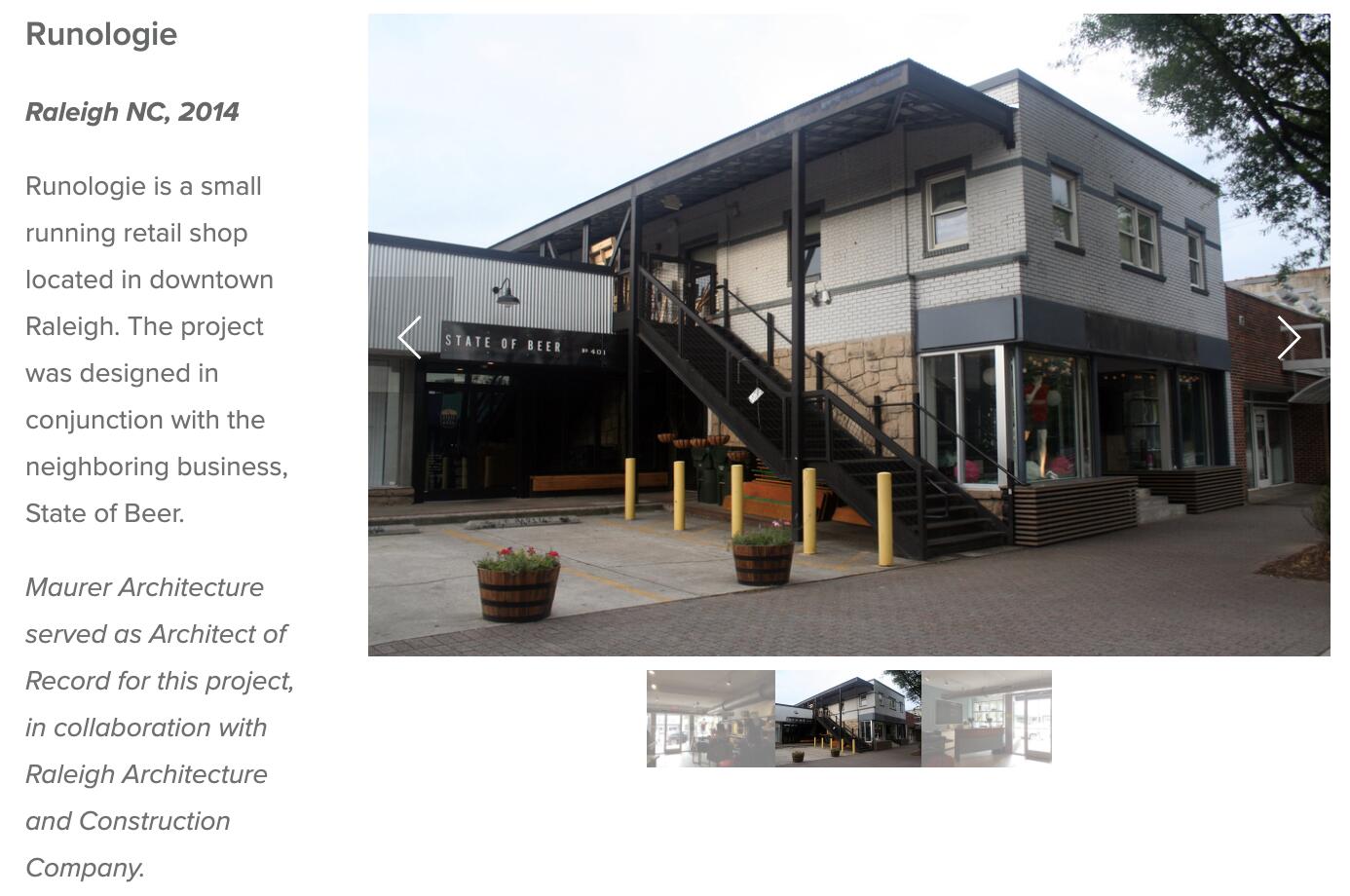
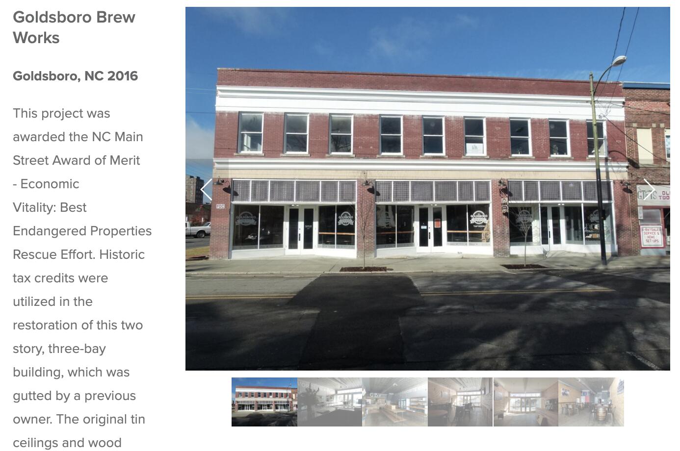
If you expect this South Park project to be designed to completion by Maurer, I’m worried the new buildings will look much more like the bland, un-interesting Site Review sheets and not like the renderings everyone is enamored by. Is it just me, or should we take a minute to stop being awed by prettier pictures (which could be inaccurate!?) like moths around a lamp?
4 Likes