It’s disastrous I think the flag should have the current logo and blue or black background, not the old logo with color stripes like we’re the canadian flag. Okay.
2 Likes
The city flag is completely ordinary, nothing special, nothing memorable. I am ALL FOR a new design.
1 Like
Just because I am in a grouchy kind a mood…I say:
As no one has yet to say what Raleigh actually “is” I think that it actually defines Raleigh very well. And while I am not proud of saying that, there is truth in facts. And until Raleigh “finds itself” the flag actually remains what Raleigh is…nothing special, but it sure does a good job of trying to be more than it is. Hey, maybe there’s a flag in that…? ![]()
I like the flag much better than the trendy sorta of meaningless new logo the city has adapted. I understand the “updated” logo, but it just looks like computer generated yuk to me. I am not opposed to a new flag, but certainly not that bland, suburban, soulless tree the city is using now.
Not that I have a strong opinion on it. 
All the flag needs is the new logo and a black background that more practical and basic and what other cities do not a big deal no muk muks.
Black, as a rule, is a terrible color for a flag. It disappears into the background, unless you are at sea and about to raid and plunder a ship.
And muk muks? You lost me.
4 Likes
Well blue, I just hate that old city of Raleigh logo with the old green Cree whatever it is yuk.
Honestly, I don’t think the new logo is as bad as a lot of people here give it credit for. From a branding perspective, it’s an amateur mistake to think that a logo will just magically give you some sort of meaning and symbolism; you need to consciously keep using it and making it yours until it’s true. Like “fake it 'til you make it” -but bigger.
If you go back to the Raleigh city branding thread, there were a few threads talking about Durham’s flag and branding. The simple colors and the seven stars are honestly pretty basic and you could easily recreate it on PowerPoint -but it fits Durham because Durham embraced it and actually went with it. Same thing with Nike’s logo (which looked no less than a crappy brush stroke when it was first drawn), or the Maryland state flag (it probably looked way tackier and stranger in the 1600s than today).
And it’s not like Raleigh doesn’t have any opportunities to actually make some artsy, lasting designs with their new logo/design language. Nope, not at all.
4 Likes
I don’t like the idea of just slapping a logo onto the flag. The green and white version above does a great job of incorporating the logo design into a flag concept. I like it.
I wonder if there is a way to incorporate the red and white checkered pattern from the Raleigh coat of arms (on the back side of the flag) without making it look too Christmas.
4 Likes

updated the Sir Walter squirrel flag
10 Likes
Got a package today. These are unnecessarily hard to find.
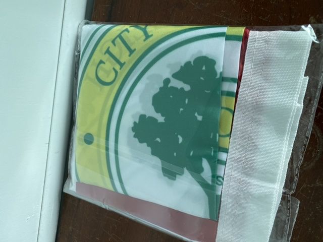
9 Likes
How about a flag inspired by Middle Age flag designs? Dual or tricolors plus a symbol. This one is black and white with the Coat of Arms of Sir Walter Raleigh.

5 Likes
Random question, but I have been seeing some red flags featuring a white acorn down on East and Bloodworth Streets around Transfer Co. Anyone know what these are?
2 Likes
It’s a bloody coup! The squirrels are taking over! Run!!
10 Likes
Where did you buy this from? I tried checking out the link Leo posted earlier (apparently 3 years ago now, please- make it stop  ), but it appears they have all sold out. Previously, I’ve had no such desire to own a city flag (or any type of flag really). I’m not sure if it’s a retroactive form of FOMO or nostalgia, but dang I sure do want a COR flag now. I don’t have a flagpole but I’d put it on my wall or, perhaps more realistically, not bother taking it out of the package and keep it in the dark corner my closet for mere memorabilia sake. Yours looks so nice.
5 Likes

14 Likes
That’s a way better flag than the official one.
5 Likes
The acorn is a little cute for my taste (I like the full-grown tree imagery) but I love the Raleigh arms integrated into it.
5 Likes
I agree… surely we must have something more unique and interesting that can represent our city than an… acorn?
I think something oak-related is fine - own being the City of Oaks (thankfully Oakland is all the way on the other coast), plus we don’t exactly have any thrilling natural or manmade landmarks.
The diamonds from Raleigh’s coat of arms are pretty distinctive - it’d be really cool to essentially have a toned down version of the Maryland flag.
2 Likes