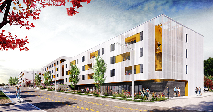
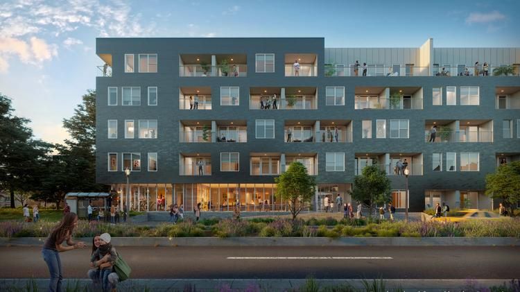
Finally a positive comment. Thank you! There are a lot of passive aggressive folks on this forum that, IMO, like to throw stones at almost any development/design that is put out there, yet don’t involve themselves in our community in any other way. It gets a little old!
I like it too. It’s not perfect by any measure, but the added density is much appreciated and the design is acceptable at worst. So long as it gets built I’ll be happy. 
This happens so much here that it’s almost comical: Mind-numbingly generic design is posted. People criticize it. Others say “iT’s BeTtEr tHAn WhAt’s ThEre!!!”
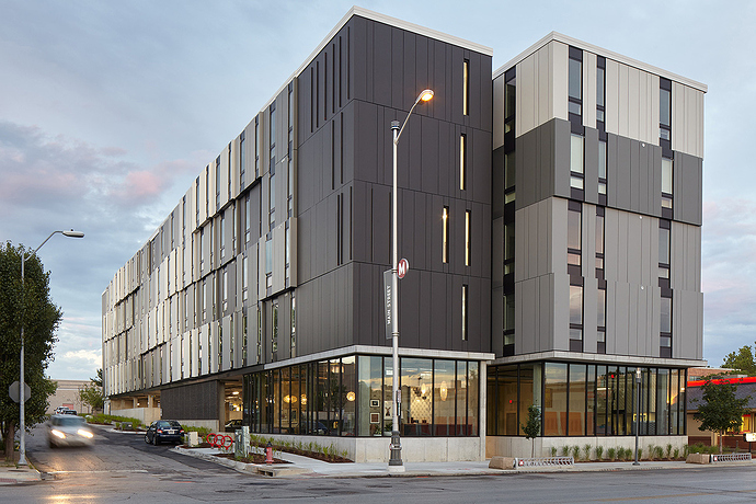
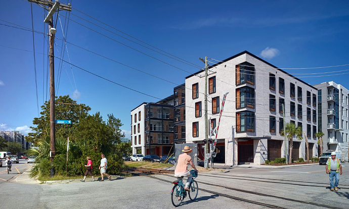
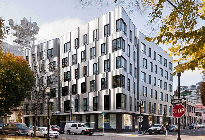
Yes, but almost anything would be. Why is it so bad to want more than the bare minimum for our city? Granted, I’m an architect, so I’d love to see something inspired, but that’s never an expectation. It’s not about ground-breaking innovative design; it’s about doing basic things like creating a distinct ground level (whether through set-back or material change), adding depth or texture to a facade, using materials other than brick or beige stucco. All of these are my biggest issues with this design, and I don’t think it’s too much to ask for a little bit of effort for urban buildings on limited prime property, which may be here for the rest of our lifetimes. Like… this building is generic almost to the point of parody, and it is not that way because of zoning restrictions. It is that way because of thoughtlessness, profit, or some combination of the two. Since you asked, here are a few apartment buildings in peer cities.
Kansas City
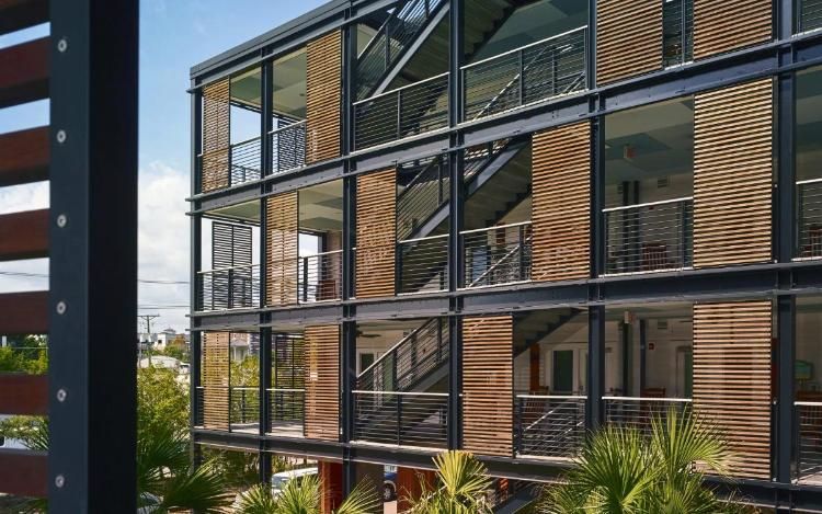
Charleston, SC. This is affordable housing for seniors, by the way.
Portland
Harrisburg, VA (in the works).
St. Louis
These are from a quick search; I’m sure I could find many better examples. But look at the variety! Do we have a single apartment building in Raleigh nearly as distinctive as any of these? Perhaps not yet, but there are great local examples of condo buildings in the works, like The Fairweather and The Bartlett (Durham). I hope we’ll get more. But I’m going to keep being a dick about designs that I think are poor quality, because I think Raleigh’s better than that.
Sorry for the rant… hope this helps you understand where I’m coming from.
Go to any city and the vast majority of all buildings are “generic af”. Tokyo. Paris. London. New York. Chicago. DC. Most buildings don’t stand out. This is fine. I kinda wouldn’t want to live in a city where every building was screaming LOOK AT ME!!
If we’re still going with the old ‘it’s better than the Hardee’s’ then we’ll keep getting the same generic stuff. Yes, other cities have some repetition of their own but we seem to be even more repetitious than them. And some of the changes aren’t even that expensive, they just take some will power from the community to ask for better. @elevatoroperator has shown this
Yeah, I mean can we at least just stop doing the “1-6 stories brick, 7th story concrete” look… It is literally the same design as every single 5-7 story development around here. It’s almost bordering on parody at this point.
And that ‘concrete’ on top is often EFIS which quickly looks dirty. Case and point: @Francisco 's favorite Marriott Hotel at City Plaza. I look at it every day wondering when they’re going to clean all that black mildew off. Some tried to fight for better design of the hotel and exclusion of EFIS but a similar ‘it looks better than anything we got’ prevailed and now we (almost) all lament there isn’t something better for our ‘signature’ hotel.
I appreciate you posting some projects you like. I think the Portland and St. Louis ones look pretty cool. IMO some of the others aren’t better than this proposal.
I think that this is a nice project that is going way beyond the minimum standard. In addition to lots of density and a nice overall quality this has ground level retail, underground parking, and exensive streetscaping including a generous sidewalk with different patterns, lots of plants, a fountain, etc. Everyone else obviously has a right to their opinion as well.
I mean… just do that last story brick, too. What is so wrong with doing the same material for the remaining 10% of the exterior??? WHO THINKS THIS LOOKS GOOD??? 
I think it looks fine. The apartment building is nearly identical style to the new Dillon apartment buildings. And the hotel has the design features emphasizing the rooftop bar and restaurant. Not really in a signature location, so blends in well and doesn’t really need to stick out.
This is what I mean… it’s identical to the Dillon apartments… and the Stanhope apartments… and the Friendly Apartments on Hillsborough… and the 109 Park Apartments on Hillsboro… and the 401 Oberlin apartments… it goes on…
I kinda wouldn’t want to live in a city where every building was screaming LOOK AT ME!!
Neither would I, and that’s not at all what I’m advocating for. As someone who largely designs cultural/public buildings for a living, I understand the importance of having a field condition from which important architecture can distinguish itself. But are our standards so low that having a distinct ground level treatment and some depth in a facade means a building is screaming “look at me”? I posted these examples specifically because I think they’re decent and respectable urban buildings, but they’re not crazy or architecturally noteworthy. With the exception of the affordable housing project, none would ever win a design award.
Go to any city and the vast majority of all buildings are “generic af”. Tokyo. Paris. London. New York. Chicago. DC. Most buildings don’t stand out.
Again, it’s not about standing out. But by and large, the bare minimum standard in all of those cities is WAY higher than it is here. You would be hard pressed to find a building this generic being proposed in the core of London or New York or Paris. There’s far more diversity and a wealth of outstanding design in all of those cities, but that’s not surprising – they’re top tier cities. Again, I think I was pretty clear that my standard for not being “generic” is not groundbreaking design or something that even necessarily stands out – it’s just… not a parody of modern construction.
You are right though that this kind of poor design is not unique to Raleigh (it’s been written about a lot this year), but that’s precisely the problem. The fact that buildings like this are common does not make them more acceptable. A poor quality design like this is worthy of criticism no matter where it’s built.
I think this design looks fine. My opinion, describing it as poor is a bit far. I’d put buildings like Gramercy and 222 Glenwood in that category.
I appreciate you posting some projects you like.
Just to clarify, I didn’t post these because I like them. I would’ve used an entirely different set of examples if I were trying to find apartment buildings that I think are exemplary design, or buildings of my personal aesthetic taste.
I posted these because they show that variety in this kind of building typology IS possible in a city of our size, and because I think they are objectively better buildings from an urban perspective. They also weren’t designed by a CAD monkey or some kind of algorithm that cares only about the bottom line. Aesthetic taste is absolutely subjective, and you are fully entitled to your opinion about what you think looks better. (@mike, you too). I respect that.
I think that this is a nice project that is going way beyond the minimum standard. In addition to lots of density and a nice overall quality this has ground level retail, underground parking, and exensive streetscaping including a generous sidewalk with different patterns, lots of plants, a fountain, etc.
I agree with you about the underground parking. That’s fantastic to see. I don’t consider any of the rest of this to be noteworthy beyond a superficial level. Street treatments are great, but they can be be easily redone or improved overtime. Not as likely with the architecture.
I’m gonna ban myself from ranting any more about this topic after this, but I just want to point out that – while I am a modernist through and through – the quality of urban buildings has never really recovered since the 1950s. Look at our early 20th century urban architecture, and observe how common a setback or material change at the ground level is. Notice the considerations of proportion, detailing, depth, and materials, all of which acted as effective counterbalances to the economic bottom line. I wouldn’t say any of these older buildings stand out, but the “generic af” building of 1920 was a superior urban building to the “generic af” building of the 2010s, because it did all of these things to break down large buildings to a pedestrian scale.
And aside from being generic, I don’t actually think this proposal is the worst thing in the world. It’s clean, and it’s got a good urban corner going for it. As others have pointed out, there are worse offenders in the city. My single biggest grievance with it is that there is no relief at the ground level, and the brick clumsily meeting the ground creates an imposing mass. A small setback or ending the brick cladding at level 2 would’ve worked wonders.
Inspiring can also improve returns.
Also, isn’t it a shit world where most things only get done for maxing out profit? Even in America, it wasn’t that long ago that things got built as a matter of pride.
@elevatoroperator says it right here.
Investment vehicles and other money making strategies that involve real estate arose and now dictate the built environment.
Just pointing out this is my litmus for historic stuff…materials and building techniques no longer in use. Virgin wood frame. Structural common bond brick. Limestone gothic details. None of this is coming back. I think the vector is firmly pointed towards cheaper and cheaper until some things get unpacked like REITs, property tax comping etc.
Truth. Agreed on all fronts…

Well using the most overused meme in the last month to make a point does seem to say that you are ok with the most overused building styles out there.
